The Layout
Journaling reads: When Mom posted this picture on Facebook, Nini immediately thought about Papa sitting out in the yard playing catch with Daddy from his lawn chair.
The Details

I decided to start this post a little differently. I have been watching quite a few process videos lately and the thing that captivates me the most while watching these videos is watching the girls show the paper they are going to use on their layouts. I see the prints that they are intending on using and my creative mind goes into overdrive, I start imagining the layout I would create with that combination of papers… Obviously, like most of us, my obsession is paper. I can’t even think about a layout until I have my paper figured out.
Since seeing their paper before they start working inspires my creative process, I thought that for once I might include a before shot of my papers. So, here is the page kit I put together:
As you can see, some of the papers were just scraps that were leftover from an earlier project with these papers. I don’t know if it is readily apparent in this photograph but I also mixed what I had left of the Fabulous line; including the “real” paper from Simple Stories and the knockoff version by Recollections and sold at Michaels. The big difference between the two lines is that the Recollections version has glitter added to it and is missing the stickers and some of the “solids” from the line. I was going to use the doily print as my background paper, so I did not mind that it was a little glittery… I decided to use it instead of the double sided print I still had in the Simple Stories stash.
I am playing with what version of pictures look better. Here is the layout taken with flash on.
This photo was taken with the flash off.
The colors seem more “true” with the flash off; but the details show up better with the flash on…
Oh!! The conundrums of a scrapbook blogger.
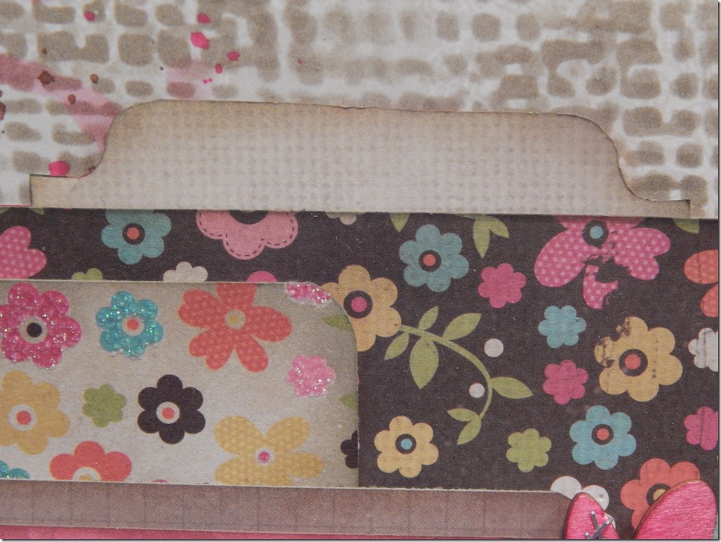
I had all my papers picked out and knew my layers would be born from playing with my pieces and getting the placement just right, so I cut my pieces and inked all my edges. I wanted to play with inks and stencils again on this layout, so I pulled out the burlap texture fade stencil from Tim Holtz and used the same distress ink that I used to ink my edges (Frayed Burlap). I added some stenciling to the off-white doily paper I was going to mount the pink floral paper to. I also pulled out the “tea stain” stencil from Tim Holtz and added a few coffee cup stains to the top left and the bottom right corners. I then splattered a little brown, pink and white spray ink from Dylusions to those same corners.
I started adding my layers, leaving some of the edges lifted so additional layers could be cut from the journaling cards I had picked out for the layout. I stapled some and pop dotted others. I cut the title from a journaling card; as well as the subtitle, “100% all-natural, original, genuine girl.” This may be cliche, but it does describe my Miss Averie to a tee.
After adhering all the layers, I started fiddling with my embellishments. I used the “washi” like strips from the sticker sheet and adhered them to the subtitle with staples.
I had this little pink doily that I had gotten on clearance at Michaels. I love these little doilies… they are so cute, but I have really struggled to use them. I layered a woodsy heart that I painted pink with my Dylusions spray ink. I really liked the look of the heart and decided that would be the focal point of my visual triangle. I gathered a few more hearts and painted those pink as well, and added some staples to the hearts with my tiny attacher and glued those to the page as well.
I really do like the look of the staples in the heart. I will have to do this again.
I also have a little file tab at the top of the page. I intend to add the date to that tab, but I have misplaced my date stamp… so it will have to wait until it is found.